Jan 31 2012

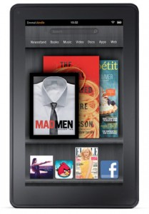
Kindle Fire Review

It’s been a while since I’ve bought this little gadget, and I realized that my review has been sitting in “draft” status for months, so… here you go!

The good:

  • It came pre-charged and pre-registered to me. I didn’t even have to enter my Amazon info; I just started it up, it downloaded a software update, and I started using it after a brief tutorial.
  • The size is pretty nice, and it’s good to be able to hold the device with one hand. It doesn’t quite fit in a standard pocket, but it does fit into the side pocket on my cargo pants, and in the inner pocket of my suit.
  • The PDF reader flipped pages pretty fast.
  • Notifications system is pretty neat — just a little number up top which you can click on. Uses this for downloads too; at first this confused me because I downloaded a PDF, and didn’t know when it was done or what to do.
  • $200! Quite a good price point. The biggest selling point.

The Bad:

  • No 3G option, so you’ve gotta be near WiFi to use the cloud services (and most things with it are stored on the cloud).
  • Seems a little laggy.  Not annoyingly so… but on the edge of annoying.  Animations aren’t smooth, but they are noticeably choppy. I’ve heard that other Android tablets tend to be even worse though.
  • No physical home button. Not only am I used to this with other devices, it makes it harder to quickly figure out which side is up and which is down.
  • The PDF reader is sub-par.  For example, it doesn’t support bookmarks (as in, ones that the publisher added), nor does it allow you to have multiple files open at once. I really hope a version of GoodReader comes out for Android. Tried Adobe’s reader, which does support bookmarks, but it’s pretty slow in initial rendering of pages, and also doesn’t support multiple files open at once.
  • The back button seemed a little glitchy — most times I had to tap it twice to get it to work. I’m sure this will be fixed in a future update though.
  • It was very hard to tap on an app/document in the “coverflow” view. I had to try 4 times to open the document I wanted.  Even now after I kind of have the hang of it, it takes 2-3 careful taps.

Overall

It’s a neat little gadget, but not nearly as great for general use as an iPad, and not nearly as good for reading as an e-ink reader like the Kindle Touch. The only real use I could see for it is for people doing LARPs who need something that can fit in a large pocket as a rules reference. If you want a tablet device and you’re on a budget, it’s a livable alternative to an iPad.


Aug 25 2011

Why Steve Jobs Stepping Down Could be Good For Apple

Yesterday, Steve Jobs resigned as CEO of Apple, volunteering himself to be chairman of the board instead. I predicted that their stock would plummet, but my company’s president (also named Steve!) said he didn’t think the stock would drop much because Apple “graduated everyone into the idea that he’s out.” Turns out, Steve was right — guess there’s a reason he’s in the driver’s seat.

In any case, I think this could be great for Apple. Actually, when Jobs leaves completely, I think Apple could make some great strides forward. How, you ask?

Because they won’t have Jobs’s ego holding them back. As one big example, HTML 5 is not replacing Flash, sorry buddy. Flash does not drain batteries like the filthy whore that Jobs makes it out to be (as proven by Flash running fine on hacked iPhones).  If iOS devices were to support Flash, that would knock out the main advantage that Android devices have*.  And hey, maybe they’ll be more willing to admit to mistakes too.  Remember that whole iPhone 4 antenna issue and Steve Jobs’s response to it?  Yeah.

Edit: It has been pointed out that I only used the example of Flash, which does not a valid argument make.  So as another example, Apple has a somewhat-recent policy of disallowing apps from linking to their own websites where people can buy stuff.  This, I feel, comes from the Jobs-like mentality of, “We’re the best, if you want in on our platform you play by our rules and give us a cut of everything that happens on our device.”  However, this will ultimately weaken them as companies turn instead to web apps, as Amazon recently did with their Cloud Reader. This gets consumers more comfortable with using web apps, and companies soon realize, “Hey, you mean I only have to pay to develop this once, and it will work on any mobile device with a browser — including both Apple products and Android products?  Sweet!”  More companies do that, meaning iOS has fewer exclusive apps, and consumers have a more viable choice in alternatives.

In general, I feel that Jobs has an attitude of, “We are the market leaders, therefore the market goes where we say, not the other way around.  We tell people what they want; they do not tell us what they want.”  Which, to some extent, is true.  But that level of ego also blinds one to their own weaknesses, which is to Apple’s detriment.

* I’m sure Android devices have many other awesome advantages, but from an average non-tech-savvy average Joe perspective, Flash is really the one functional thing missing from iPhones and iPads that Android has.


Apr 6 2011

Review: iPad 2

Yeah, I jumped on the bandwagon. I upgraded from my iPad to an iPad 2. Who can resist the geek-chic siren’s call of new Apple products?

Seriously though, the iPad took the market by storm, and the iPad 2 is superior (in my opinion) to the alternatives — both those currently on the market, and those hitting soon. That’s not to say that it doesn’t have some glaring flaws as well. So, let’s get to it.

The Good

  • Camera — The biggest change in the iPad 2 was the addition of a front-facing and read-facing camera. It works as advertised, though the rear-facing camera doesn’t seem to be as good as the iPhone’s. Honestly, I think they could have done away with that one entirely and made the front-facing camera better quality for better quality videoconferencing.  Though after a bit of playing around with it, I do have to say it’s a bit of a pain to transfer video from the iPhone to the iPad — to do it without annoying sync operations through iTunes you have to buy a 3rd party app, in fact.
    • Skype video over a 3G connection is not so great.  When I tested it, I was around 3-4 bars of signal (out of 5), so perhaps this would be better with 5 bars. I saw the other end okay, but they said I was doing the jitter, freeze-and-catch-up thing.
    • FaceTime is pretty awesome.  There was a bit of blurriness when FaceTiming with my girlfriend on the same WiFi network, but the network had been acting a little funny that night anyway.
  • Smart Cover — I thought this would be a neat thing but nothing too special; however, it’s actually surprised me. The magnets are stronger than I had thought they would be, making the cover much more stable in the stand-up configuration than I expected. The triangle-fold allowing stand-up or slight-incline is useful, and much easier to use than the cases Apple pimped for the original.
  • Battery life — When a device gets smaller, that usually means the battery gets smaller, as does the battery life. In this case, Apple managed to make it smaller and faster while retaining the amazing battery life. Some tests have even shown it to have superior battery life when compared to the original, but my bet is that they were using a brand-new iPad 2 and a year-old iPad, so there would be some battery degradation on the latter.
  • Sexy softwareiMovie is pretty awesome, though it does take a bit of getting used to (I wish they had a tutorial or something available within the app). Using iMovie is a much better experience on the iPad 2 than on the iPhone 4. I haven’t tried Garage Band yet (haven’t even bought it), but it seems fairly awesome.  And the operating system in general is intuitive, smooth, and sexy. You don’t have to read any manual to use this thing — you just turn it on and go.

The “Meh”

  • Fingerprints — The oleophobic coating does help… a little. Mostly they help in removing the fingerprints more easily, not so much with preventing them. So the thing still gets fingerprint smudged to hell. The magical covers have a glass cleaner on the underside, which… kind of works, but not really. And because of the shape, even the bit that it does work makes causes issues because where the fold creases are in the cover, there is no cleaning, so you end up with vertical smudge stripes where the cleaning bits didn’t touch.
  • Speed — This was actually improved a lot, but I list it as “meh” because the original acted very snappy, so the speed increase doesn’t really affect the experience much. Rebooting is notably faster, but you hardly ever need to do that. But if you’re interested in the boot time difference, check out this video I made.
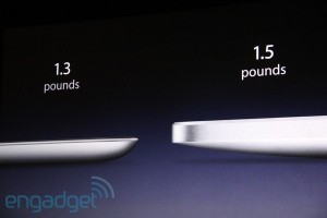
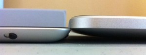
  • Thinner — It is notably thinner, and feels better in the hand. However, I put this in the “meh” section because it causes some issues too — mainly, the angled edge. It makes it really awkward to plug in the sync/recharge cord, and ejecting the SIM card was unintuitive (click that link to see). Also, it’s much thinner and only a little lighter, which means it’s actually more dense, which in turn makes it feel heavier.
  • No back protection — Yeah, you can get a third-party case for it, but it is sort of a shame that the flagship covers don’t protect the back of the device from scratches. I’ve been babying it, and so far so good, but I’m betting that it’s going to develop tiny little scratches soon.
  • Big iPod Touch — Let’s face it, there really isn’t any difference in iOS between a handheld device and the iPad. There is tons of whitespace between icons, for example, and overall you can really feel that the OS wasn’t made for a tablet device.  The same was true of Android until recently with version 3.0 (Honeycomb).

The Bad

  • Expandable storage — It still doesn’t have it. There were rumors that it would, and I was hoping that because the tablet market is heating up bigtime that Apple would see that they need to compete in this way to lure photographers. But no, they just made an SD dongle that allows you to transfer photos and videos to/from an SD card, but not actually use it as extra space.
  • Adobe Flash — There is no Flash support now, or ever (unless something changes drastically).  There are some alternatives to watch Flash video, like an app that costs $5 and converts from Flash to a playable format, but that doesn’t work with Hulu, and it doesn’t at all work with Flash apps or games.  Steve Jobs would like you to think that Flash is going away in favor of HTML 5.  He’d mostly like you to think that because he wants it to go away, and if he can convince everyone that it is going away then it will become a self-fulfilling prophecy. I’ve got news: Flash isn’t going away.  Get over your shit, and support it.

Conclusion

I really like the iPad 2 a lot. For me, the video conferencing is definitely worth the upgrade. And if I didn’t get on the bandwagon with the first iPad, I definitely would have with this one. If you’re thinking about upgrading, I’d recommend trying to sell the old one on eBay first to see how much you can get for it (look to see what others are selling for and expect to get about that).  Or give it to a friend or your significant other and get the upgrade for yourself. People made fun of Jobs for calling the iPad “magical,” but once you play with one for a few days you’ll realize that it really is.

A final note, on Android tablets: Some of the Android options out there are neat, but none really compare to the iPad 2. They try to sell themselves on hardware specs, and honestly that shit just doesn’t matter. The iPad is relatively cheap, thinner, and more polished than the competition, with more killer apps. I hope that Android tablets will catch up, but right now there’s really no competition.


Mar 1 2011

My Love/Hate Relationship With the Nostromo N52

I have a Nostromo n52 gaming pad for use with World of Warcraft, and I both love it and hate it. Here’s why:

Love

  • Macros. You can program it to do all sorts of macros that the WoW UI won’t let you.
  • Convenient movement. This is really the biggest thing for me.  I can use my thumb to do all of my movement, instead of the standard — which is three fingers on WASD, which switch away from movement to press other buttons.
  • Comfort.  It has a great ergonomic design (whoa, buzzword from the 90s), that just feels really comfortable.
  • Design.  It just looks cool… though not nearly as cool as the n52te (tournament edition).  The astute may notice that the n52te is essentially the same as the n52, with some pretty lights added — they found the right formula, and they stuck with it.  Though some have issues with the software for that model, saying that the original is better.

Hate

  • Reliance. I feel like I rely on it now; without it I can’t really play effectively. This isn’t a huge deal, but if I’m on someone else’s computer, it takes a while to get reacquainted with the keyboard.
  • Chatting. It’s very hard to switch between playing and typing, and because I’m a lazy bastard this means I usually just don’t chat because it’s too much effort. Which is extra bad since I already tend to get focused on the game and not pay attention to messages, so I feel like I’m doubly ignoring friends and guild-mates.

I don’t know if these weren’t popular enough, or people started moving to mouse-based solutions (Razer, WoW mouse), or what, but there has only been the one update to this several years ago, and nothing further.  Which is disappointing — my perfectly functional gadget is old, so I need to replace it with something betternewer, damnit!  Ah well, maybe I’ll try out a Razer. Or… just stick with what I’ve got since I rarely play WoW anyway.


Oct 12 2010

Review: Apple TV 2G

Today I received my Apple TV in the mail. This is the second generation Apple TV, and it costs just under $100. As with most of the stuff Apple makes, it's sexy. And the $100 price tag is pretty impressive and un-Apple-like. I've had a full-on media center PC in the past, but those are big and clunky and unwieldy in all ways; the Apple TV goes in the opposite direction.

However, spec-wise it's honestly not all that hot. Here are its shortcomings:

  • It has no hard drive of its own (to speak of). This isn't a big deal for me because I plan to stream everything anyway, be it from Netflix or my PC.
  • It only does 720p HD video, so no 1080p. Again, not too big of a deal for me — honestly having watched 720p and 1080p, at the distance I view my TV at I can't tell much of a difference. Here's a chart showing how far away you have to be to notice 720p vs. 1080p vs. 1440p.
  • It can't adjust the volume; I have to use my TV (or stereo) remote to do that. This, I admit, is a major peeve of mine. During playback, the up and down buttons aren't doing anything anyway, so why not make them adjust the volume? Maybe I'm missing something; it seems so obvious that it should have this.
  • It can't view Hulu. Or anything else other than YouTube. This is annoying to me, but I'm not sure if it's a deal-breaker. Most series, I watch on Netflix. But then again, stuff comes out on Hulu more quickly, and a lot of stuff just isn't on Netflix.
  • It can't play many video formats. This is also somewhat annoying, but there might be some workarounds for this in the near future. Though likely those workarounds won't allow for smooth playback of HD material. The other option is to re-encode videos in a format that iTunes likes, though that requires Quicktime Pro ($30).
  • It has no keyboard, which makes typing text a huge pain. However, it does work with the Remote app, so you can use your iPhone or iPad as a remote, and use their keyboards. I would be very, very annoyed with text entry if I didn't have an iPhone or iPad.

Okay, so what does it have?

  • Cheapness. Can't complain at $100.
  • Simple to set up. You plug in an HDMI cable, and the power cable, and you're ready to go. It just works.
  • Small, sleek form factor. My friend came over today and I showed it off to him, and he couldn't even see where the box was until I pointed it out to him.
  • A tiny remote and simple user interface. Very simple; even your grandma could use this thing, once she figures out that the Menu button is sort of like an exit/back button.
  • 720p HD video. Videos streamed from the PC and Netflix look nice and crisp. The latter noticeably more crisp than from the Wii, which doesn't do HD.
  • Built-in WiFi. Hey, some devices these days (ahem, XBox 360) don't include this.
  • Integration with iTunes. You've got access to your desktop's music, movies, etc.
  • Optical digital audio out. All newer receivers have it; so you don't have to hook up tons of wires to get sexy 5.1 surround sound.
  • Built-in video rentals. This would be cool if the rentals were cheaper. Most more recent movies are $5, and older movies seem to run about $3, with some at the $4 mark. Halve those prices, and you've got me interested. I mean, RedBox rentals are only $1 per night, after all.

Overall from the first night of using it, I like it. It's responsive, Apple did a good job as always with the UI, and it's overall a much more pleasant experience than watching Netflix over my Wii. I have yet to even tap into a lot of the potential, like the movie rental thing, and I'm sure in the near future someone will jailbreak it which will open up a world of possibilities. However, the Apple TV does have some serious competition coming out in the next few months, such as the Logitech Revue.

The Logitech Revue, which will run Google TV, is much sexier than than the Apple TV tech-wise. But it's also three times the cost, at $299. On the other hand, it has none of the shortcomings listed above that the Apple TV does. Also, it hooks up to your cable connection and acts as a TV guide and DVR. Except I ditched cable TV, so neither function is useful to me. It can do live hi-def videoconferencing, which sounds awesome… except it costs $150 for the webcam (you can't just use any old webcam), and I think that much like the iPhone 4's FaceTime feature, this is a neat gimmicky feature that I would never actually use. But overall the Revue is really more like a mini-computer than the Apple TV, which provides a lot more possibilities. I am very interested to see what other Google TV set-tops come out around Christmas.


Sep 8 2010

iOS 4.1 Preliminary Review

There were a few neat improvements in iOS 4.1. It had some smaller bug fixes of course, like fixing the proximity sensor so that you're less likely to hit the mute or end call buttons with your cheek while you're talking. Neither has happened to me, but my girlfriend did once suffer from the accidental mute issue. It also has a game interaction feature, where you can invite friends to join in on games, earn achievements (I couldn't personally care less, but there seems to be a craze over achievements in the gaming world), and that sort of thing.

But there were two big updates that really interested me personally: high-def uploads, and HDR photos.

High-Def Uploads

Now the built-in movie uploader (which can upload to YouTube) is able to upload in full 720p high-def. if you're on a WiFi network. It used to force the resolution down, so my first iPhone 4 test video actually got uploaded as low-def.

HDR Photos

HDR stands for "high dynamic range." You only really need to use this option if the photo you're taking has very bright and/or very dark areas that you want to come out better. The phone snaps 2 shots in quick succession and uses some magic to combine them into one good shot with (more) consistent lighting.

Here's an example, normal on left, HDR on right:


You can click the images for higher-resolution versions.  However, this doesn't really do much for photos that aren't high-contrast. Here's an example of a normal and HDR version of a picture with consistent lighting:


The second one actually looks worse, in my opinion — a little more washed-out (since it's darkening the really light areas and lightening the dark areas). So make sure to only use this option when you need it.


Aug 25 2010

New AT&T DSL Service, Actiontec GT701D Modem

Recently AT&T was running a deal where their 6Mbps DSL service is $20 a month for an entire year, then $45/mo after that (they might still be running it). I was paying about $65/mo for cable modem service through Comcast, so even after buying the modem, this will save me about $500 the first year, and $240 every year thereafter. Slightly slower service, but really that’s a no-brainer for me.

The default modem that AT&T recommends is the Motorola 2210. According to all reviews I’ve read about this modem, it overheats and dies a little over a year after setup. So searching for alternatives, I found the Actiontec GT701D, which (as an added bonus) was also $30 cheaper. The only downside is that AT&T tech support can’t help much with the setup. I figure I’m handy with computers, so I’ll take the gamble on the cheaper and better modem.

Short story: everything worked out fine (eventually) and now I’m on my DSL connection.

The Actiontec didn’t initially connect up with the automagic detection, so I had to do a bit of snooping. It’s a very good thing that I still had my old ‘net connection running, to do some Google Fu. After a bit of searching I found the right settings. For anyone else out there in this situation, here’s what those settings are:

Username: attreg@att.net
Pass: attreg
VPI: 8 (this is for AL, FL, GA, KY, LA, MS, NC, SC, TN; other states use 0 for this)
VCI: 35
DSL Mode Setting: ADSL2 (EDIT: after a modem glitch and talking to Actiontec support, this is apparently supposed to be MMODE. No clue why ADSL2 worked before).
ATM QoS class: UBR

Note that the username/password are only for initial setup. You have to go to the registration URL to set up your real username/password. But do note that the password you use for your modem is the alphanumeric string that gets automatically assigned to you, not the one that you type in yourself.


Jun 26 2010

iPhone 4 Preliminary Review

I got my iPhone 4 a day early (thanks to ordering it through the Apple website), and have taken some time to try out its features. I’m coming from a 3G though, not a 3GS, so this thing is probably more impressive to me than it would be to someone with the latter.  So, review below, with important parts in bold.

General Feel

This thing is way more responsive than the 3G. Then again, the iOS 4 did seem to speed up my 3G a bit too, but it was still fairly laggy for most things. The iPhone 4, however, feels just about as snappy as the iPad (which is to say very snappy).

The battery life seems good.  The first day I used it more than moderate but less than heavy/constant, for about 8 hours — recorded maybe 6 minutes worth of video, lots of app downloading and use, compressed a couple of videos and sent them to YouTube, etc. I also had WiFi and Bluetooth on. That used up about half the battery, which is nothing magical, but still pretty impressive. Second day, with a bit of talking, Bluetooth turned off most of the day, and medium to light usage, between 10am and 6pm the battery is at 70%. Not too shabby.

I didn’t think that I was going to even notice the snazzy “Retina” display that packs tons of pixels in tightly, but I actually do notice things being much more crisp.

Form Factor

I’m not in love with the design, but I don’t hate it either. It is rather annoying that accessories that I bought for my 3G (like case/protector, car dash mount, etc.) won’t work with the iPhone 4. It is thinner though, which is subtle but can still be noticed, and I like the design of the buttons — raised and separate.

The smudge-resistant glass actually works fairly well. Well enough that the smudges that do show up are subtle, and get cleaned off completely when I put the phone in my pocket and take it back out again.

Video/Photos

The camera does seem to take better low-light pictures from my preliminary tests, though nothing magical — you’re not going to get great low-light photos from any smartphone with current technology. That’s mitigated by the flash though; the LED flash does seem to help a lot. The general picture quality of the front-facing (main) camera is quite good. About as good as a point-and-shoot camera in fact. I took the picture on the left last night (click on it to see the full-sized version). It was enough of a close-up that I had to tap to focus.

Video quality is good, though holding the phone in your hand to take video isn’t the most natural thing in the world. It also disappointed me to discover that you can’t switch between the front and back cameras when recording video — it’s either one or the other.

There is also a built-in utility to upload to YouTube. On the downside, it downsamples to 320p, so no uploading hi-def videos directly to YouTube from your phone. On the plus side, that means it doesn’t take a year and a day to upload videos. I’d like the ability to control this.

The rear-facing camera seems pretty decent. Not as swank as the front-facing camera, but definitely good enough for basic self-photos. One thing that would have been nice is a fake flash for this. I bet someone will make an app for that — something that makes the screen mostly white but shows just enough of what the front camera is seeing so that you can tell what you’re taking a picture of.

iMovie

iMovie is pretty basic, but a cool toy. It allows you to do some very simple video editing like adding a single non-DRM song as background accompaniment to your video project, mesh multiple videos and/or photos together (with some basic transitions), add a Ken Burns effect to your photos, and add a title to your video.

Things that I think that I should be able to do in iMovie, but can’t:

  • Set the volume level of the music clip.
  • Set the music clip to start somewhere other than the beginning of the video.
  • Make the music clip start somewhere other than the beginning of the song (so I can start playing at the good part of Final Countdown, for example).
  • Crop the music clip, to make it stop playing when I want it to.
  • Insert a title over a photo (it can only be added to a video clip as things stand).
  • Add multiple music clips.
  • Insert an image into the middle of a movie clip, so that the clip pauses to show the photo, then continues.

Here’s a link to a quick clip I tossed together of Link at White Wolf | CCP getting “iced” at work, video taken on iPhone 4 and edited with the iMovie app.

Miscellaneous

You lose reception if you hold the phone in your left hand. This is apparently a known issue, and Apple’s reaction has been less than reassuring. I’m not sure if this can be fixed (without a recall of some sort), and it’s pretty astounding that it got through Apple’s QA. I’ve heard that this issue is also fixed by using the bumpers that Apple sells, so I assume that when protective cases come out those will solve it too. So while it’s certainly a bad flaw, functionally it won’t affect most people. I’m assuming that most people will use a case anyway — otherwise the screen is at risk of breaking if you drop it.

The voice commands are new to me, since I didn’t have a 3GS. They seem to work fairly well — not much better or worse than your average voice command system.

Conclusion

The iPhone 4 is definitely a worthy upgrade from a 3G. If I had a 3GS… maybe not so much better that it’s worth another 2 year contract and $299. Probably not worth it, really. In fact, I’d probably have been better served to get the discounted 3GS, but I’m a technophile and have to have the latest and greatest. The camera quality is great, the phone itself is responsive, and though it’s definitely not the perfect phone, I am quite glad that I upgraded.

Jun 23 2010

iPad Follow-Up: Thoughts, Apps, Etc.

I really do like this thing. I’ve actually got myself a messenger bag (i.e. man-purse) just so I can tote it around, in fact.  I plan on getting a stylus for it, since I think its note-taking abilities will be rather keen.  Who needs a moleskine?
As an update on the PC charging issue, most motherboard manufacturers have resolved this issue.  My manufacturer (Gigabyte) even came out with a quick-charge update to charge the iPhone and iPad even faster.  Huzzah!  However… it still doesn’t actually charge when I hook it up to my system.  Boo!  Might be that I’ve got too many other USB accessories plugged in.
Speaking of accessories, I would very much like a case that both stands up, and also has some internal pockets for holding papers, cards, or whatever.  These two features seem to be mutually exclusive from what I’ve seen, but there’s no reason it can’t be done.
Okay, on to some apps that I like:
  • NetFlix – This is probably what I’ve been using it for the most.  Kick back in bed, watch an episode of Avatar the Last Airbender.  This also seems to work well over 3G, not just WiFi (though I’ve only tried in areas with full-bars of reception).
  • GoodReader – GoodReader iswas a mandatory app if you plan on reading PDFs on your iPad. However, iBooks is going to handle PDFs soon, so I’d wait to see how well that works before shelling out money for GoodReader.
  • HarborMaster – Neat little strategy game, that’s free. Well not really “strategy” — you have to direct different boats into different ports, and then back off the screen, without letting any crash into one another. It’s harder than it sounds.
  • Dropbox – File syncing service, which is also accessible via iPad. I’ve found this quite useful for work.
  • EverNote – Not nearly as useful without having a camera, but still a great application for compiling random notes. A favorite amongst people of the GTD philosophy.

And the built-in photos app is just too cool.  Check out the demo here (Photos is the third one down, my favorite bit is about 2:40 in).

Really the big feature is the 3G connection though. I’ve found this useful enough for work that even if they hadn’t got me one, knowing what I know now I’d have bought one myself.


Jun 12 2010

iPhone 4 vs. HTC EVO

I’m deciding between the iPhone 4 and the HTC EVO.  I’ve wanted to try out an Android phone, but I’m really on the fence here. So I’m rounding up the benefits of each that are important to me (so I’m not including things like how the iPhone 4 supports wireless-N, or how the EVO has a 1.3mp front-facing camera as opposed to the 640×480 one on the iPhone 4, or how the iPhone 4 has a higher-resolution display).

iPhone

  • Better battery life. The first iPhone and the 3G models had pretty crappy battery life, but this seems to get better with each iteration. All reports of the EVO say that its battery life is horrendous.
  • I’m already used to the interface. This is a minor quibble, but I already know how things work on the iPhone.
  • More refined user experience. Even with the modified version of Android that the EVO runs, the interface on the iPhone is more refined.
  • I’m already with AT&T.  I’m really not a huge fan of them, but neither do I hate them. Familiar devil, I suppose.
  • Better video chat.  The EVO has the front-facing camera, but the only real video chats supported are through Fring and Qik, and that doesn’t seem to work too well. Then again, realistically I’m not likely to use video chat a whole lot anyway.

HTC EVO

  • Not a closed system. Anyone can make Android apps.
  • Integrated kickstand.  Yes this is lame, but could definitely come in useful, especially with video chat.
  • Better alert system.  It’s not limited to one alert message at a time like the iPhone. I suspect since this is a big flaw in the iPhone future updates might fix this though.
  • About $20/mo cheaper. That’s almost $250 per year, $500 over the life of a 2-year contract.
  • Tighter Google integration. You can actually have an app for Google Voice, and the built-in navigation system uses Google Street View, which is rather awesome.
  • Supports Flash. This can be a big one for web browsing. Apple, get the fuck off your high horse; HTML 5 is not going to replace Flash.

One big features I didn’t include with the EVO is that it’s 4G.  Frankly, I don’t care.  3G is fast enough for everything I want to do with my phone — if I’m going to stream HD video, I’m going to do it on my iPad.  Plus from all accounts I’ve seen, using 4G sucks the battery life out of the camera like a nympho just out of solitary.

My friend Eddy Webb at White Wolf just got himself an EVO, and posted about it if you’re interested in reading his take.

So far I’m leaning toward the iPhone. I’ve got 3 days to decide.